
Promotions Feature
EVERGAGE
User Centered UX Design
The Company: Evergage, (now SaleForce Interaction Studio) was a cloud based B2B personalization and customer data platform that used data and machine learning to provide cross channel (web, mobile, email, and third party) personalized business solutions to their clients.
Problem: Customers wanted to use Evergage's machine learning algorithms to generate their promotions on their websites and email campaigns.
Goal: The goal of the project is to add the ability to add a promotion with multiple images and to add a promotion into an email campaign and web campaign.
The Action:
- Defined the problem and identified the requirements and the use cases.
- Wireframed and brainstormed initial sketches.
- Created mocks in Axure.
- Worked with the engineers to implement the feature.
Impact: The feature was successful and verbal feedback from the Customer Success Team confirmed that the clients used promotions in their campaigns to increase revenue and loyalty.
Hypothetical Success Metrics: Define success metrics of clients for our top client use cases, for example revenue and conversion rate. Measure those metrics with those clients before vs after this feature and check for variables.
My Role
Product Designer, Project Lead
The Team
Myself, Engineer Lead, Support Team
Methods
Interaction design, user flows, collaboration, initiative, leadership, visual design, user research
Tools
Photoshop, White board, YouTrack, Google Docs
Designed Screens + Workflow
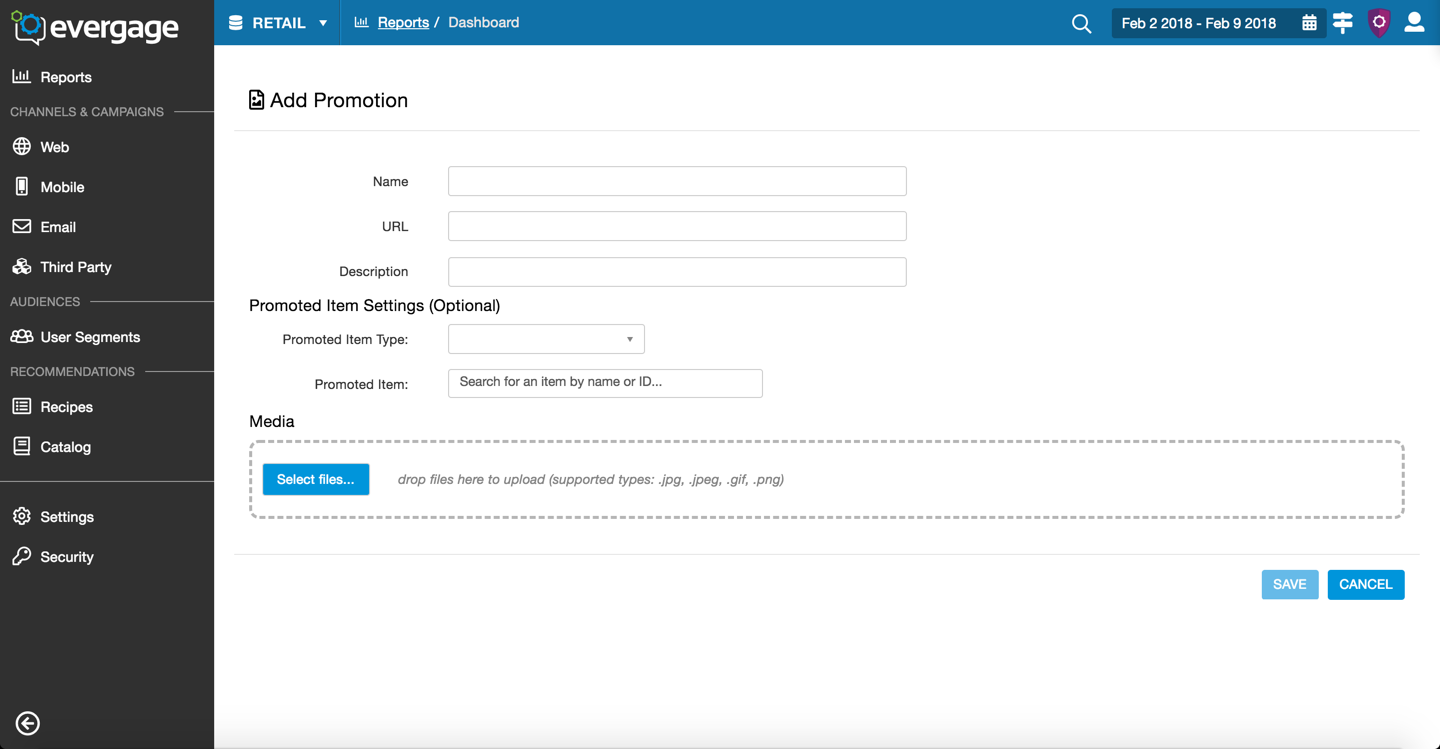
Step 1: Add a Promotion
When you intially add a promotion you add the details and media in one screen. This is so that the information is discoverable. Most users will add 1-3 images per promotion.
Note - across all these designs the breadcrumbs/navigation is different. They all should follow the same pattern as image 2 (Manage Media), yet that was a bug in our product.
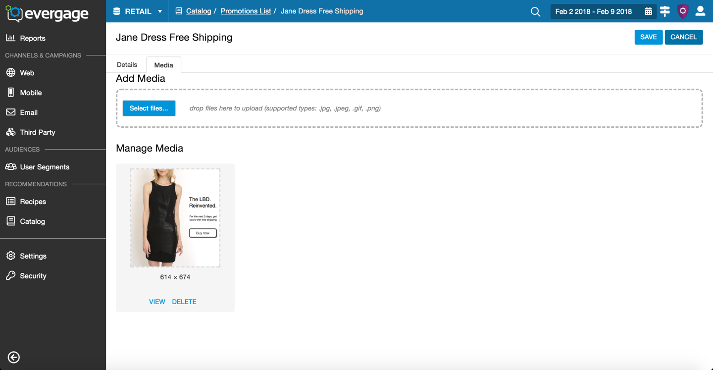
2. Manage Media
Once the Promotion was created the media and details split into sections. This is to allow for more images in the future and for the edge cases that had more than 3 images.
The "Add Media" button is not in an optimal location from a logic perspective.
Issues - view and delete are the same color and can cause an issue with the user mistaking one for the other.
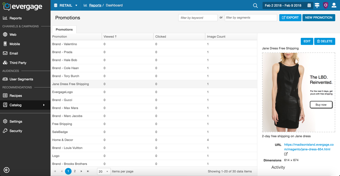
3. Promotions list Screen
Standard list screen with data in the columns and the promotions details on the panel to the right. This screen followed the patterns of the other list screens in the platform.
For promotions with mutliple images, the first image added would appear in the panel with a list of the dimensions of the additional images. The most common use case was the same image in different sizes which is why I chose that treatment.
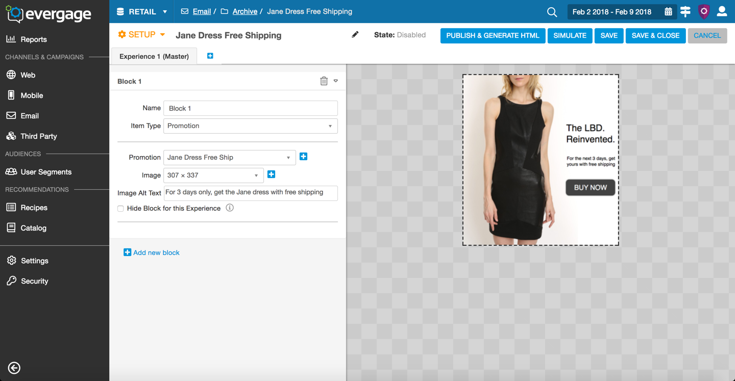
4. Add a Promotion Into an Email
Evergage email had many options as to what you can add and how you can optimize your email campaigns. To add content to an email you must selected an Item Type. Once the user selected Promotions as their desired Item Type, the options for that promotion appeared below. I used left/right align for the elements and their labels because it was a clean design and followed our style guide.
The blue plus sign icon to the right of the dropdowns allows the user to add an image into a promotion while in the email editor. We added this functionality based on Customer Success team's feedback. They informed us that clients often didn't know what images had been up loaded into Evergage and wanted to be able to add them in as they were working if they didn't see the option available. This would save the time.