
Message Settings Redesign
EVERGAGE
Collaboration + Communication | Leadership + Initiative | Strategic Impact | User Centered UX Design
The Company: Evergage, (now SaleForce Interaction Studio) was a cloud based B2B personalization and customer data platform that used data and machine learning to provide cross channel (web, mobile, email, and third party) personalized business solutions to their clients.
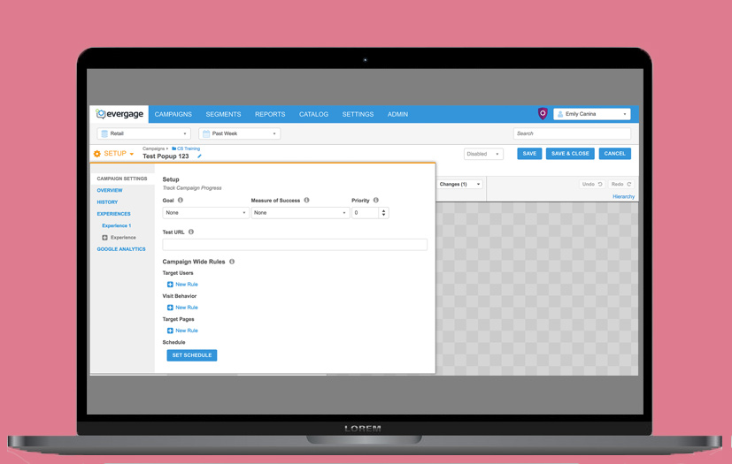
Context - The personalized business solutions mentioned were called campaigns. Each campaign contained 3 levels of rules - campaign level, experience level, and message level. The full project was to redesign all levels of rules, yet this story will focus on the message level.
Problems:
- Unituitive rule logic. Most users, especially when they were new, had difficulty understanding the rule structure and logic.
- Low discoverability - Users struggled to find rules or didn't know certain ones existed.
- Messy UI - the elements and styles were inconsistent and looked broken which caused our users to lose trust in the functionality of the rules.
These problems caused user pain and frustration, made it more difficult for the Customer Success to onboard new users, caused users to send in more support tickets asking about the rules, and created potentially dangerous workarounds.
Goal: To make the rules more intuitive and discoverable, and to clean up the UI.
Impact: Very successful. New and existing users had an easier time discovering rules, reduced the number of unncessesary work-arounds, the Customer Success team was able to more successfully onboard new users, and there were less support tickets about rules.
My Role
Product Designer, Project Lead
The Team
Myself, CTO, 2 Engineers, Support Team, Customer Success Team
Methods
Interaction design, information architecture, usability testing, collaboration, visual design
Tools
Photoshop, White board, YouTrack, Google Docs
The Story
1. Define + Empathize
To start the project my CTO and I brainstormed and defined the project. We went through the rules and identified the main issues, what we needed to change, and next steps. The rest would be defined as the project went on. I created a document with the inventory of all the rules across message, experience, and campaign levels and their options.
Known Changes
- Refresh the UI to be more consistent, cleaner, and elevate the style
- Rename the groups and restructure the information architecture so setting up the rules are more discoverable and intuitive
- Make the bounce rule more discoverable and intuitive
2. Discovery Research
This project hit home for me because I was a previous power user of the platform and felt the pain. I had deep product knowledge and empathy for the user. To start my research I talked to our internal users, the Support and Customer Success Teams. We discussed common/uncommon use cases, where users got confused, and any other pain points and thoughts.
3. Wireframes + Paper Mockups
I sketched out the use cases, common rules, and thought through the logic. These designs were focused on the information hierarchy and the logic behind the rules. I focused on making the rules more intuitive and discoverable.
The CEO was invested in this project and had ideas of how to solve it. When I got this project, our CEO wanted us to change the rule groups to be - Who, what, where, and when so the rules would read like a sentence and hit the major groups. At a high leve this sounded good, but I reviewed different scenarios and rules to ensure the logic was solid, yet it didn't translate well for some common use cases. I came up with my own solution for the naming/rule structure.
4. Usability Test
I tested out my design and the CEO’s idea on our internal users, who were members of the Customer Success Team and Support team. They gave great feedback on arrears that were confusing and exposed blindspots. I discovered that the CEO’s approach didn’t work because the terms could have different meanings, like where could be location or where on the page and those didn’t work to be grouped together across all rule levels.
5. Designs
I discussed the findings with the CTO, made edits to the information architecture, and then designed my first iteration.
As I was designing, I kept in mind how changes to the message level rules would affect the other levels. I determined when to be consistent vs different. I also kept in mind how the changes to the UI components would affect other places in the platform.
Once the information architecture was more intuitive I focused on the individual rules and how to consolidate so they were less unnecessary steps and more discoverable.
Reorganized and renamed
I changed the top level rule categories to headers to expose more rule options to help with discoverabilty and efficiency.
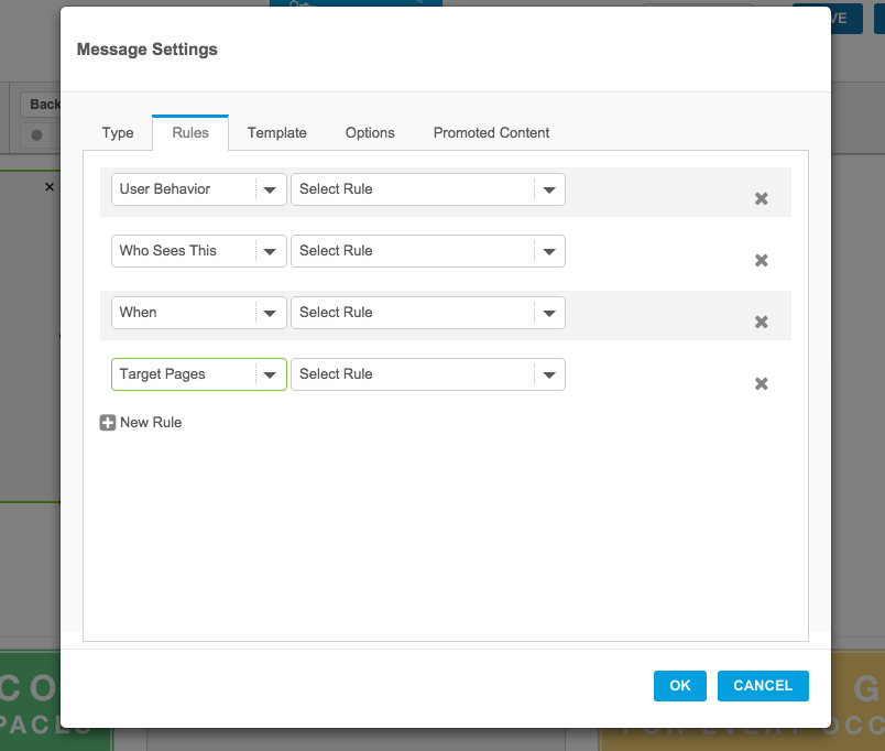
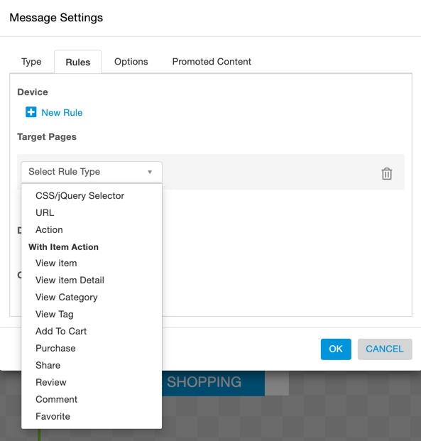
BEFORE, all the top level categories were hidden in a drop down. By default, the settings are set to device type = web. The user needs to click on "add a rule" and then a dropdown appears. At that point they select the top level for their new rule.
Note, the before image that I've shown has all of the rule options shown to show what the high level options were.
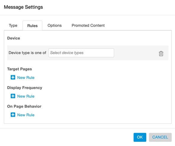
My SOLUTION was to regroup the rules and make the top level categories into headers. This allowed the users to understand the main types of rules that they can choose from.
BEFORE
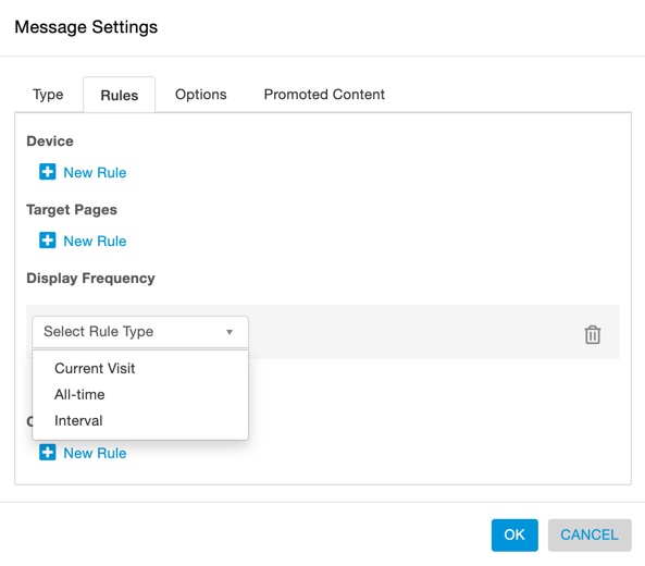
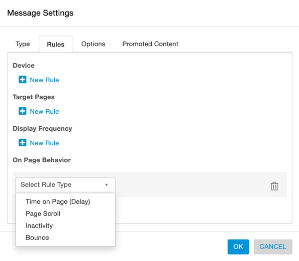
AFTER
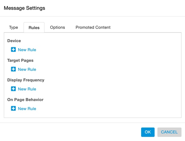
These are the options for each rule category
There are now a managable amount of options.
We worked to consolidate the rules in a way that preserved all the options.
Improved UI and Usability
I Improved the UI, by making the styles consistent and creating a cleaner style. There were many different types of elements and some looked similar yet functioned differently. You can see in the before screenshots below, to highlight some of the areas that needed improvement:
- The arrow size varied for all drop downs that was all changed to one size.
- The corner radius was either 6px or 0px and we changed to all be 3px.
- There were inner drop shadows on elements, yet the inner drop shadow isn't in our style guide.
- The border color and thickness varied and was changed to be all the same.
- Rules weren’t aligned, spacing was inconsistent, extra white space near elements, hover on interactive elements weren’t correct.
- There was a bright blue hover color that was changed to 10% darker. (not shown in mockup)
- There was unneccessary padding in the dropdowns
I improved the usability in many ways. One was by consolidating the actions and space for each rule.
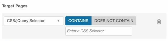
Example 1: Adding a CSS Selector Rule
BEFORE
- Click “Add rule”, Select “Target pages”
- A dropdown appears, select “CSS Selector Rule”
- "CSS Selector Rule" radio buttons with input appear. User inputs the code into the input, or selects the other radio button and inputs the code
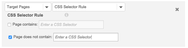
AFTER
- Select CSS/JQuery Selector from the dropdown
- Input the code or select the other radio button and input the code.
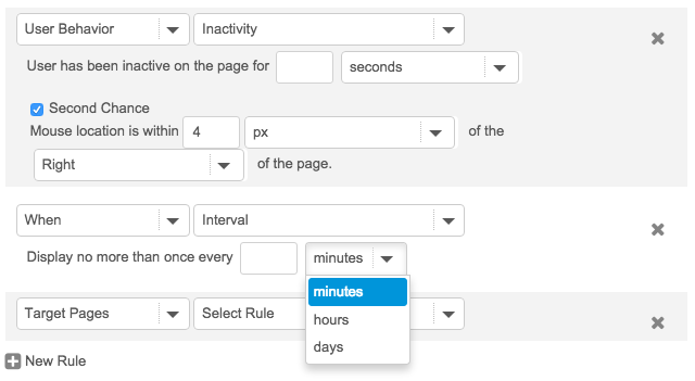
Example 2: The Bounce Rule
BEFORE
- Select User Behavior
- Select Inactivity…. User has been inactive on the page for __ seconds….appears
- Click on second chance
AFTER
- Select “Bounce” from On Page behavior.
6. Collaborated with Engineers
When the logic and regrouping was at a good point I designed the interface and worked closely with the engineers to work through the technical restraints of the library they had to use. Throughout the design process I had meetings with our CTO, where we brainstormed and challenged the logic and designs.
I identified all the different elements and color coded the doc by the type element. For example radio buttons were blue, dropdowns were green. I documented all the element types and their purpose. Worked with the engineers to make the UI consistent.
7. QA
I went through each rule and grouped similar UI patterns and then went through and QA’ed each rule variation to make sure everything was lined up. One of the things I checked was the dropdowns. For each of the dropdowns, I looked at the longest option and made the width that length, because there were so many variations, some of the combinations didn’t look ideal, but they looked good enough.