
Campaign List Redesign
EVERGAGE
Project Description
The Story: An impactful feature redesign guided by user research that satisfied the needs of multiple target personas while allowing for the platform to scale.
The Company: Evergage, (now SaleForce Interaction Studio) was a cloud based B2B personalization and customer data platform that used data and machine learning to provide cross channel (web, mobile, email, and third party) personalized business solutions to their clients.
The Problems: Feature creep, startup growing pains, persona evolution, and user pain.
The Projects:
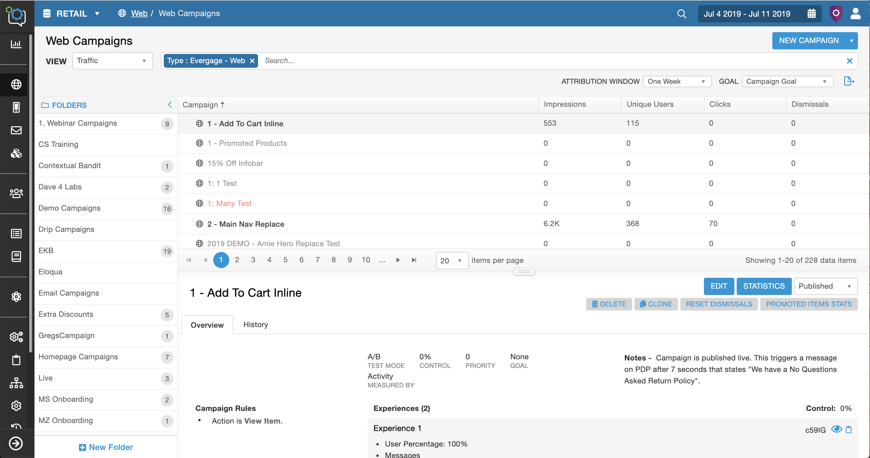
- Redesign the most impactful and visited screen, the campaign list screen.*
- Restructure the information architecture and redesign the navigation.
*Note: This story will dive into the campaign list redesign. You will see effects from the information architecture restructure and navigation redesign.
Context: Evergage was experiencing a common startup challenge - feature creep. The technology and solution was strong and the platform was rapidly growing to meet the client and market needs to remain a top competitor in the marketing tech space. The user base and number of personas grew and evolved with the platform. This combination created many user problems and pain, which consequently threatened client retention and future sales.
Yet, the straw that broke the camel’s back was that we needed to expand our campaign offering of mobile, web, third party, and bulk email to include triggered email and full support of email campaigns. Yes, a lot was going on at this time #startuplife.
The CTO (aka Product Manager and Head of Product) with guidance from the team, decided on the general solutions to fix these problems.
My Role
Lead Designer & Researcher
The Team
Product Team (Myself, UX Director, and CTO - Product Manager and Head of Product), Engineering Team (20)
Methods
Design thinking, visual design, whiteboarding, script development, user interviews, user validation tests, project management
Tools
Axure, Google Docs, GoToMeeting
Impact
- An influx of positive client feedback reporting better ease of use.
- Analysts and strategic personas noted that it took them less time to gather campaign data.
- Completed my personal initiative of successfully involving the user throughout the whole process.
Success Metrics weren't tracked. If we were able to track success metrics I would look into the following:
- The time it takes to develop, QA, and troubleshoot a campaign.
- The time it takes users to gather data and/or number of clicks it takes to get the necessary data.
- NPS score
- Sales won/lost due to UI concerns and trust
The Story
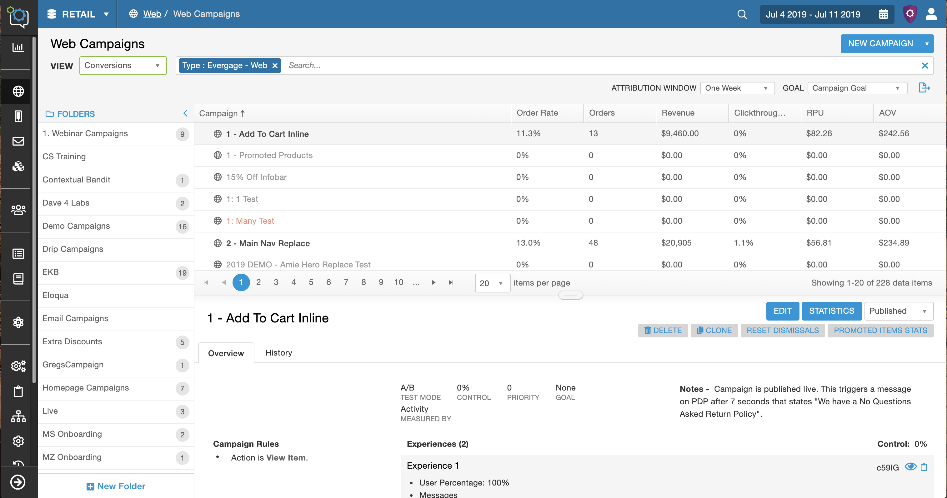
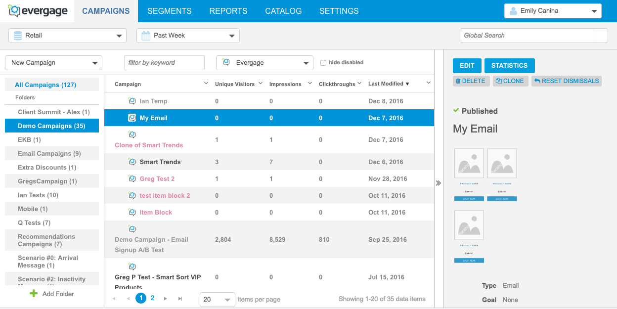
Before
After
Step 1 | Define
The Requirements
My team and I collaborated to identify the user problems and pain through feedback and user, competitive, and market research. Ask me about defining the users and problems.
We defined the technical, business, and feature requirements; and identified the target users, common use cases, and questions. As the design lead, I created the feature doc that held this information and was responsible for the upkeep and communicating with the rest of the team.
Hypotheses
#1. Better campaign management: Users have difficulty managing their campaigns and are not able to successfully manage them in the platform. By improving the campaign list screen, we can improve their campaign management. (Target persona - Manager)
#2. Expose useful data: Evergage has a ton of critical campaign data that is hidden or dispersed throughout the platform. Users needed that data in a central location in order to make the best business decisions. By adding extra columns with critical data to the campaign list screen we can improve our clients business decisions. (Target persona: Analyst)
#3. Expose critical campaign details: When users are developing, testing, or troubleshooting campaigns they spend too much time trying to find important campaign related information. The information is hidden or in different spots. If we put the key campaign details in one optimal location, we can save our users time. (Target persona: Campaign Developers)
#4. Improve the UI: The UI was inconsistent and messy (pixels were off, too much space, hierarchy issues, etc). Users and prospects needed a cleaner interface to feel more confident and comfortable using the platform. If we redesign the framework, make the styles consistent, and clean up the UI components, we will improve user confidence and trust and increase sales. (Target personas: All)
Identified the Need to Better Understand the Users
We needed to talk to the users. These assumptions weren’t strong enough to move forward and we needed to better understand the different users before I started designing. I advocated for user research and given the importance of the project I was able to get a few weeks for a user study.
Step 2 |
User Validation Study
User Interviews
My Role: Lead UX Researcher
Purpose of study: To validate the three user problems and better understand our users' campaign goals and how they interaction with the campaign list screen.
Method: User Interview over GoToMeeting
Timeline: 1 week
Users: 6 (power users across industries and use cases)
I worked with the CTO and Customer Success to select users, worked with the CS team and clients to schedule the calls, determined the goals of the study and method, moderated the sessions, analyzed the findings, and added the findings to the user, team, and company profiles for future projects and insights.
Findings
The three user problems were validated. I learned a ton from the study, including these major take aways:
1) Each of the problems were critical for different personas, which highlighted the larger problem that this screen needs to be designed to accomplish their different goals.
2) I identified patterns and common needs for each of the personas
- The campaign developers were focused on the campaign details and history
- Managers were focused on campaign management which included a mix of both data and campaign details.
- There were two types of analysts who were focused on different types of data. 1) revenue related metrics 2) conversions and clickthrough rates.
3) Strategy and organization ranged from team to team. Some teams organized their campaigns based on the campaign developer, the type of promotion, the intent of the campaign, or the campaign status. The level of organization ranged from very little to a flawless system. Some teams heavily depended on the folder system while others used third party systems like Google Sheets and begged for a tagging system.
Results / Conclusions
Solve for the three intial user problems but do so with the added parameters and the ability for the screen to be customizable.
1) Better campaign management - provide different ways to organization because there is a varying need for different types of options.
2) Expose the data - include all revenue data, conversions, and click through rates.
3) Expose campaign detail - include campaign rules and history
4) Improve the UI
Step 3 | Designs #1
Applying the Insights to the Designs
Better Campaign Management
I included both subfolders and an additional tagging system with the intent to test and see what resonated with the users. Tags were frequently requested by clients and the team had talked about adding them into the system. This was a good opportunity to test if they helped this management problem.
Customization, Expose the Data, and Expose Campaign Details
At the start of the project, the CTO had the idea that this could be solved by toggling the columns between a data view and a campaign detail view. This solution would be able to be implemented "quickly" by the engineering team, which is good because our resources and time were limited.
I reviewed the findings and even though there were three personas, this solution could be viable. The campaign developers would use the campaign detail view, the analysts would use the data view, and the managers would toggle between both.
I tried out two variations where the columns changed based on a toggle or sliding columns (outlined in red).
There was more information that needed to be added into the columns to so to create space I decided to move the location and orientation of the details panel from the right side to the bottom and during a team discussion we decided to create collapsible folders.
4) Improve the UI
I cleaned up the columns to create as much space as possible because more information and data needed to be exposed and they were the focal points. The rest of the UI improvement would happen incrementally and then at the end once the layout was determined.
Note: This project was closely tied to another feature enhancement that involved the detail panel (covered). There are other artifacts from that feature mixed into this screen, for example the rocket ship icon.
Step 4 | Design QA
Knowing When to Pivot & Advocate for the User
I reviewed the designs and checked to make sure it satisfied the all the user goals and solved the problems and looked at the bigger picture of the platform. I realized that my design solution wasn't going to work.
The Problem
This would suffice for the current moment, but wouldn't work long term becasue it wasn't scaleable.
- Evergage was expanding to email campaigns which meant there would be even more data that users would want to see in the column.
- The teams using our platform keep evolving and growing and they will want different combinations for the columns.
- This screen is critical for three major personas and they need to be able to fully customize this screen.
This meant that just two options to toggle the columns wouldn't be enough. This screen needed to seem like a different workspace for the three different personas with the potential for more variations.
Research
I needed to find a solution that allowed for more options and give the user the option to create new workspaces. At that point I went back to the white board, researched similar UI structures, and looked for inspiration. I found inspiration from the concept of a custom workspace and custom boards found in Jira and YouTrack.
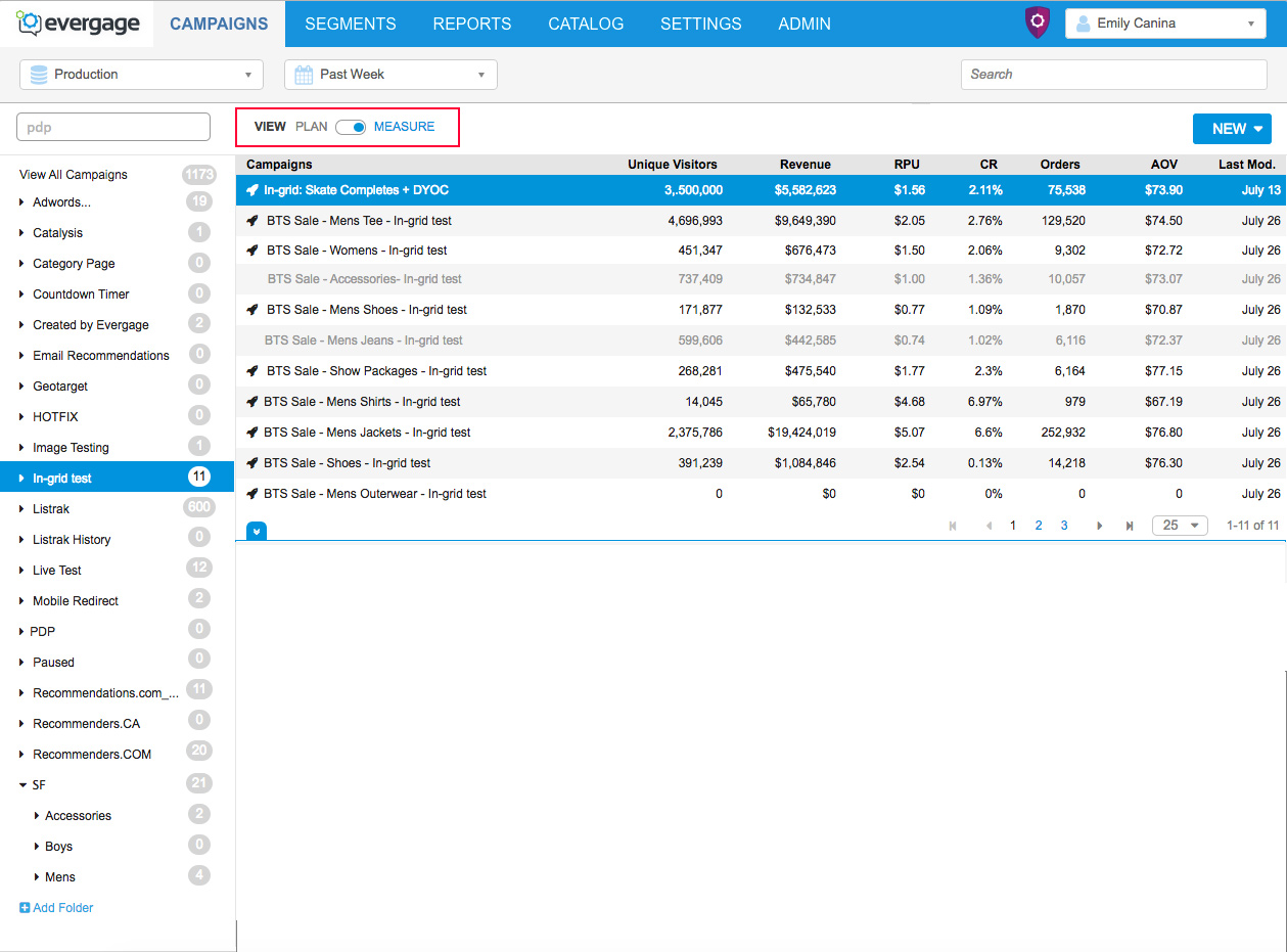
The New Solution
My new solution was to allow for multiple workspaces (column changes for now). I added a drop down to control/ change the view and each view would have different column settings, which would satisfy the different persona needs. The idea started out as the ability to be completely customizable.
Advocating For My Designs & the Users
I believed that creating views was the best solution to allow the different personas to achieve their goals on this screen. I presented my idea to the CTO and UX Director and leveraged the user insights to gain buy in and approval. The main hesitation was this would take double the engineering time to build, but the benefits I outlined outweighed the cost and I was given approve to move forward.
Step 5 | Designs #2
Second Iterations
I moved forward with my new solution and tackling the rest of the design goals including the following:
- A robust search bar to help users find campaigns
- More data, which included filters from the campaign statistics screen
- Tags and subfolders
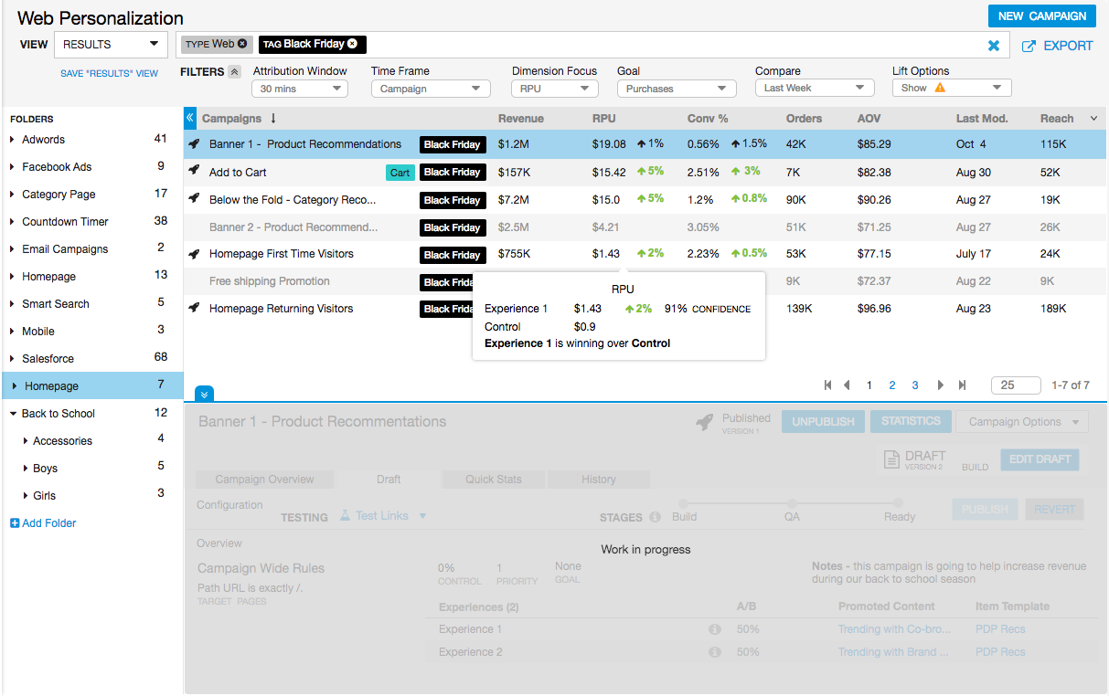
- Callouts with more granular data
Need for User Input
This would be an impactful change and the next steps were to test the new direction with the users.
Step 6 |
User Study
User Validation Test
My Role: Lead UX Researcher
Purpose of study: To validate the designs. Learn how the users would interact with the new designs, identify any problem areas, and understand what worked and what didn’t.
Method: User test with high fidelity interactive mockup (Axure). I asked the participants to complete a few tasks, answer a few questions and then I left time for an open dialogue.
Tools: GoToMeeting
Timeline: 1 week
Users: 6 (same users as user interviews)
Results & Findings
Overall, the tests went well. The two main takeaways were the following:
1) The clients were excited about the changes especially the views, search bar, and added data.
They told me how much the changes would improve their productivity.
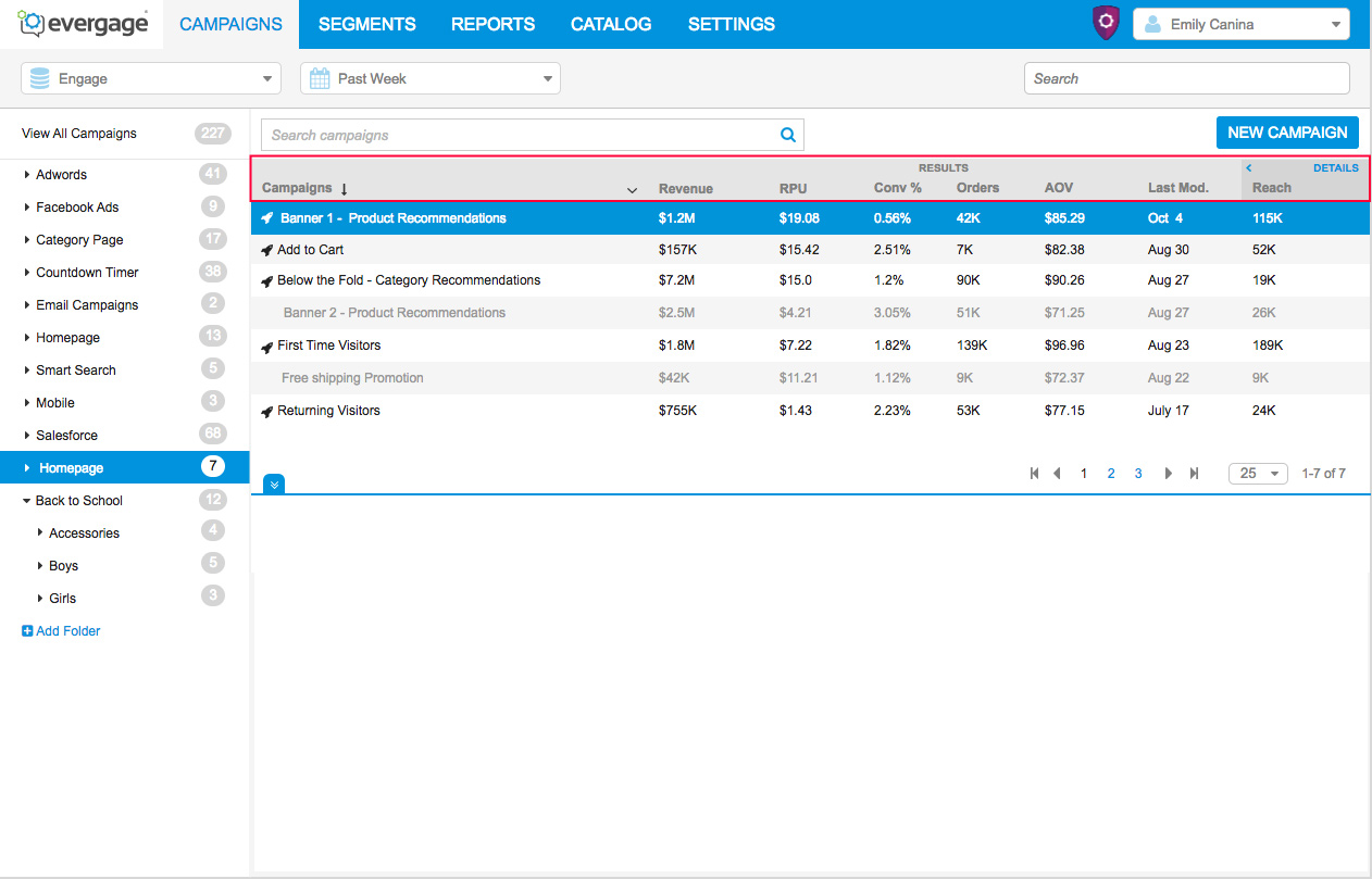
With the positive feedback on these features I moved forward with scoping the feature. I discussed technical restrictions with the CTO and made some changes. For the first version the views couldn’t be customizable, but we had decided to provide four built in options based on the user research. We also needed to limit the statistics filters to two and remove the added details on hover.
There were mixed feelings about adding a tagging system.
2) Some clients were ecstatic about the tags, but some were very against them and said they would add unnecessary clutter.
I considered this feedback in context of the rest of the project. We were making a ton of large changes and since people are generally reluctant to big change, I thought that adding a feature we knew would be negatively received wasn’t good. This could be added in the future after further investigation when we had more time to design the feature to really work.
The Final Designs
I took the feedback and created the final designs
Major Changes from the previous designs
- Changed the folder and campaign list row styles from alternating white and gray to all white with a gray separating line.
- Changed the row headers to a gray with a subtle gradient and made the folder header the same style.
- Cleaned up spacing, including reducing the spacing between the icons and the edge of the row.
- Updated the filter icon (black down arrow) on the campaign list columns to show an ellipsis icon on hover.
- Changed the font from Arial to Helvetica.
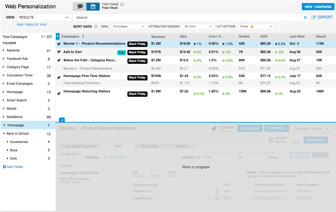
Click through to see the four view variations. (change the column content)
Conclusions
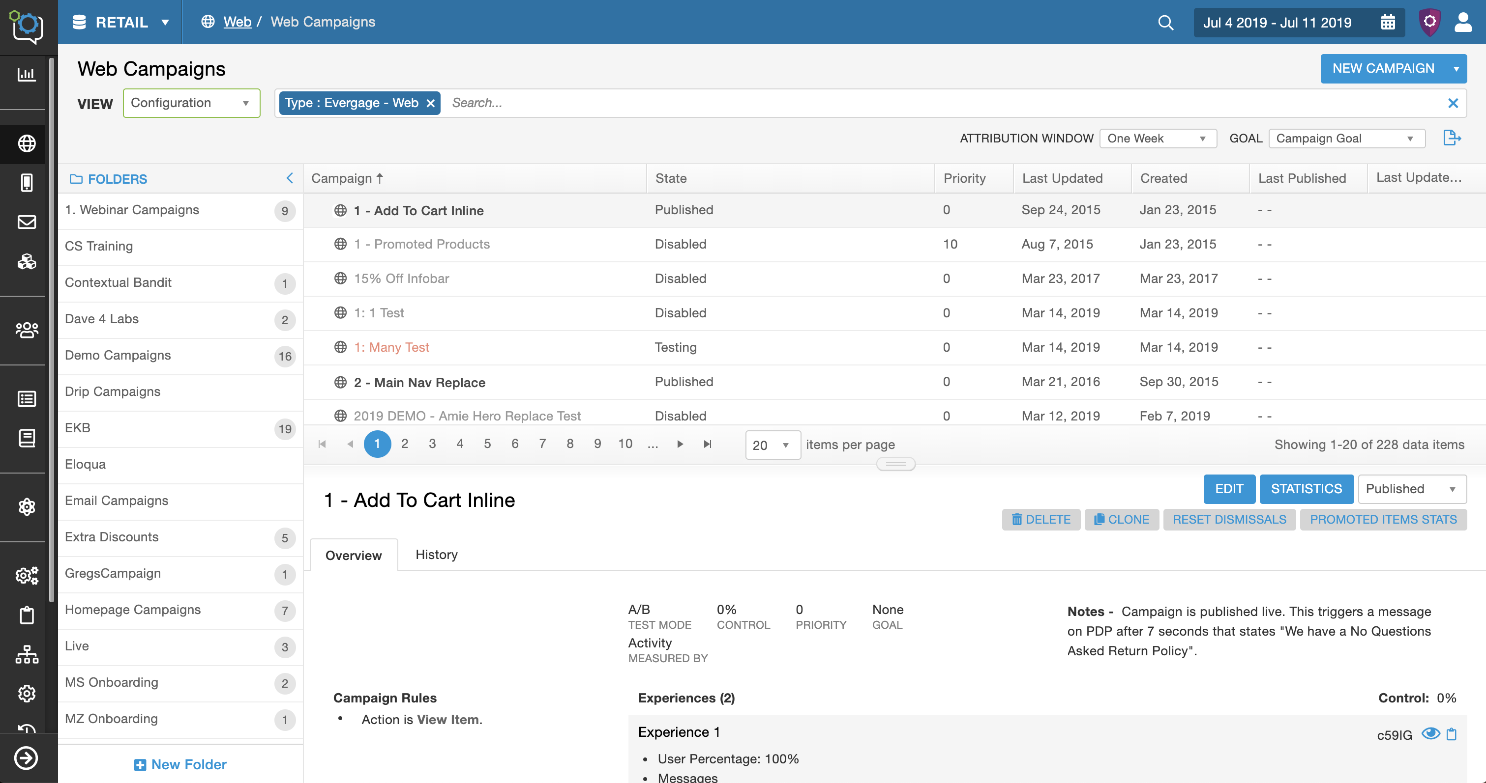
9. Implementation
The engineers were closely involved in this redesign and were already building the framework as I was designing. The pass off was this final design iteration. We had weekly design meetings with the lead front-end engineer so we could address any issues or design challenges.
10. Beta Testing
This was a major change and I wanted to ensure the users were on board with the entire redesign. The change was released on a separate engineering server. Through 8 users tests, I was able to determine that this was a positive change overall.
Retrospective
By involving the user throughout the process, the team and I were able to create a positive and impactful change for the business, platform, and users.
What Would I Do Next Time
- More time spent on the user research to understand more about how the users were interacting with the screen. There was a ton of interactions that could have been optimized, like the search bar, detail panel, and the collapsible folder.
- Customize the whole screen and not just the columns. There is opportunity to customize the detail panel and filter options which could further optimize efficiency for the different personas.
Involve the user throughout the process, this was crucial and I would make sure to do this again.